Branding
&
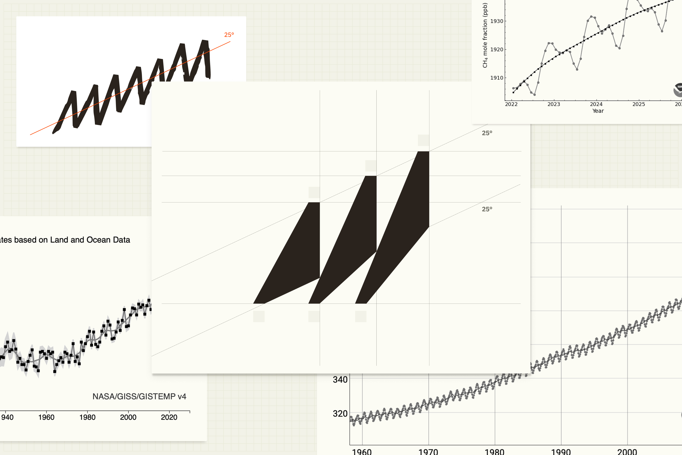
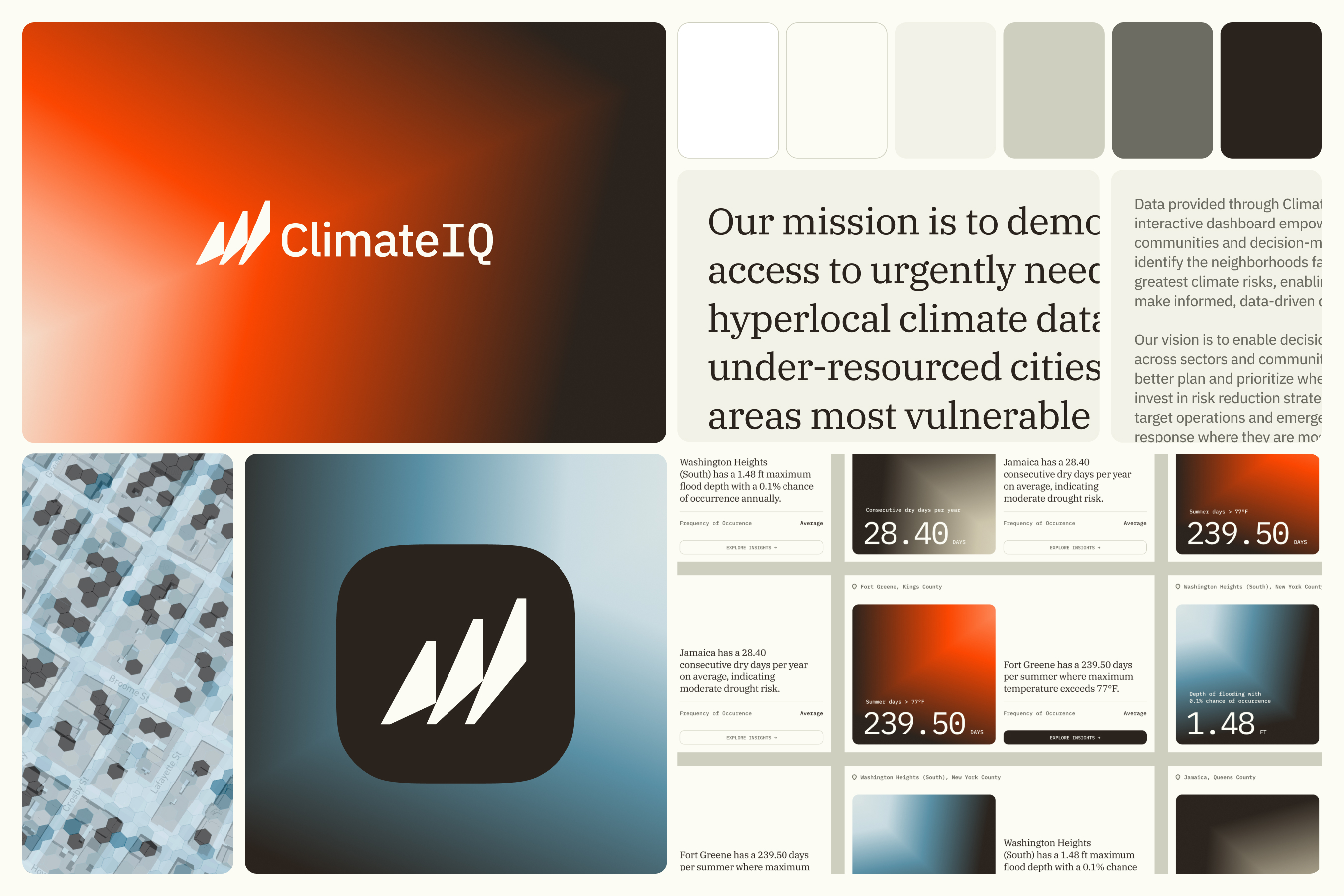
ClimateIQ transforms complex climate science into actionable intelligence for communities and decision-makers. The identity needed to balance scientific rigor with accessibility, credible enough for risk professionals, approachable enough for the communities they serve. The logo anchors the entire system. I noticed that several key climate datasets share a distinctive upward sawtooth pattern: CO₂ concentration, sea level, and global temperature. The ClimateIQ icon abstracts these patterns into a single shape: three triangles with squared angles, inclined at 25° in reference to the Keeling Curve. Beyond visualizing data, the mark conveys forward momentum and the imperative for action through climate intelligence. The visual system extends this data-driven approach through gradients built on diamond shapes. These faceted forms create a sense of depth while subtly referencing the hexagonal data visualizations in ClimateIQ's dashboard. Green and brown gradients symbolize the environment, while red and blue gradients are drawn directly from the product's interface, creating a seamless connection between brand and platform. These gradients live alongside warm paper tones that nod to the company's academic roots. Throughout, the identity walks a careful line: technically sophisticated but never cold, scientifically grounded but community-oriented. The result is a visual language that reinforces ClimateIQ's mission of turning climate data into collective action.